You must learn something new each and every day of your life, so I keep reminding my young grandsons. It’s a maxim that I still follow myself, in a desperate bid to keep my brain alert and defer that day when my grey matter finally degenerates into a useless pile of wobbly jelly.
As an example, this morning for the first time I came across the legal term “informed consent” which is explained thus at Wikipedia:
“An informed consent can be said to have been given based upon a clear appreciation and understanding of the facts, implications, and future consequences of an action. In order to give informed consent, the individual concerned must have adequate reasoning faculties and be in possession of all relevant facts at the time consent is given.”
I was led to this learning opportunity by David Platt’s MSDN Magazine Blog post The Myth of Informed Consent (go read it yourself before continuing here). He finishes with:
“We developers are the experts, and users depend on us. We cannot abdicate our responsibility by asking for guidance from someone who cannot possibly know. Informed consent in computing is a myth, and companies that claim it as an excuse for their malpractice are weasels. Stop it. Now.”
David was commenting on the a dialog box generated by Norton Internet Security which leaves the hapless computer user to work out and decide on the significance of the meaning of an obscure message. Actually, I’d go even further and call the message is obscurantist (rather than just obscure), leaving the user most likely to have to guess what to do, rather than coming to a reasoned conclusion.
Software tends to be rather difficult to design, develop and test, and in my experience the people involved typically focus on the the technical architecture/design/coding accuracy rather than the textual precision and accuracy.
Usability testers should always be involved, and if worth their salt they should pick up on wordings and meanings that are obscure, incomplete, misleading, indeterminate, and so on. I wonder how much software gets released without any significant degree of usability testing.
Sensible and accurate wordsmithing takes time and effort, hence adds cost (which is doubtless the reason why it’s often not done). Further, not all people are good at writing clearly and concisely – not to mention spelling properly, as well as using accurate terms and terminology.
As an aside, my pet peeve at the moment is the schoolboy howler error of referring to a single building as a “premise” when discussing broadband (such as Australia’s National Broadband Network), using terms such as cabling is laid right up to the premise and in-premise terminating equipment. However it wasn’t my intention here to focus on poor writing, spelling mistakes, bad grammar, and the like, bad practice as they are.
David Platt’s security warning dialog box is just one example of the sort of rubbish that software designers and developers keep forcing upon us.
You’ve surely got your own examples. Below, without further commentary, are a few others: inane, puzzling and meaningless gibberish from software vendors big and small, that I’ve collected over the years …

Mr. Software Vendor, I do happen to run more than one application at a time,
not just the one YOU developed, whichever it is of all that are currently active!
And I have multiple hard drives.

At least I know that the problem’s occurring with Eudora,
but that’s about all I know.

Thanks for telling me, so what?

I knew this was associated with Acronis True Image. but what should I reply?
[It took some time to discover which of the drives was “hard disk 7’ and
I wonder why they don’t make it easy by quoting the drive letter instead]


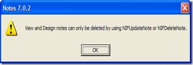
I do really like Lotus Notes, but all the same …

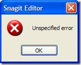
Techsmith does it too (not just IBM Lotus Software) …
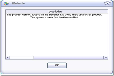
… about as useful as the following:

Does the right hand know what the left hand is doing?
UPDATE: here’s one that I got just a say or two after posting this story…
The above are laughable, but for God’s sake: 
Stan Cross (in Smith’s Weekly, 1933, Australia).
This is one of my favorite illustrations of all time!


No comments:
Post a Comment
Note: Only a member of this blog may post a comment.