One thing that really annoys me is poorly designed web forms. There are far too many of them. Why don't form designers put them selves into the mindset of those who will be filling? Is that too much to be asking for?
Apart from the horror of forms that lose all your carefully-entered information if you hit the Back button, which can be rather a programming challenge to handle appropriately (and a fundamental browser architecture shortcoming that needs to be resolved), it continues to disappoint and amaze me that even elementary usability faults still abound.
Simple things like:
- Fields that are too short for the field contents to be visible with horizontal scrolling
- Comment fields that are just a few rows in depth
- Check boxes used where radio buttons should have been [for multiple-choice questions where only a single response is valid]
- And a particular annoyance of mine -- form fields that handle North American postal and telephone values but do not cope with international values
- I was reminded of this when today I came across a form that was designed quite well, and I'd like to pass on my compliments to Techtarget.com for the good form design! Having received an newsletter from them inviting me to subscribe to yet another nice service of theirs (SearchServerVirtualization.com).
I decided to take up their offer, and launched the specified registration page: http://go.techtarget.com/r/786206/57192
If you open it yourself, you will be able to view the source code and see what they've coded. In this discussion, I'm interested in the Member Profile section at the bottom of the form, the type of form that you would get for just about any registration, which looks like this:
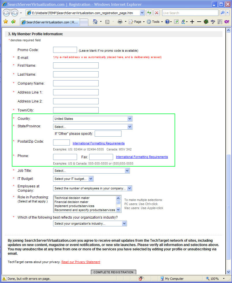
My e-mail address was automatically placed into the form and I have deliberately obfuscated it.
I'd like to focus on on that part of the form which is surrounded by the green rectangle. It's here that very many web forms on other USA-centric web sites are deficient, and this is an excellent example of how to do it properly:
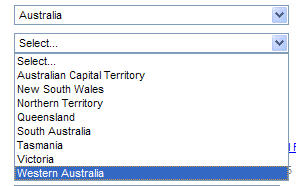
- Selection of states, provinces, regions, zones outside the USA.
Most us-designed web forms provide a selection list for US states and dependencies, but just have "Other" or "Non-US' or "Not in USA" for all other parts of the world. If I live in a country like Australia that has states, there's absolutely no excuse for them to be listed in the form, like this: (As you can see, Techtarget.com also has the "other" option, anyway.)
 - Postal/zip codes should be catered for. Make sure that the field is long enough. Why not allows, say, twenty characters?

The Techtarget form also has a link labelled International Formatting Requirements that opens a separate window to provide some background guidance about the proper entry of postal codes and zip codes. On top of this, there are some examples (albeit for the USA and Canada only). In Australia we have four-digit postcodes, but I've used some forms that give an error message insisting on five digits (the minimum for US zip codes) so I've been forced to enter an unnecessary leading zero! - Telephone number formats vary quite a bit from country to country, so it's probably best/easiest to just have a single field (say, twenty characters long). But many US-designed forms have three separate fields that allow only for a 3-digit area code followed by the number broken onto a 3-digit field plus a 4-digit field.
Such a filed layout is not good at all. Firstly, it makes no allowance for country dialling codes, such as +61 for Australia or +44 for the United Kingdom. Here I'm using the "+" convention for country code prefix, of which some people are ignorant and this presumably includes some insular web form designers! (Which is strange, since if you want to call an overseas number on your mobile/cell phone you need to use the "+" button to signify that the country code follows.)
A further complication is that some countries -- Australia and the United Kingdom being two of them -- use a "0" (zero) prefix for long distance non-international calls. We have the situation where some people signify that this zero must be dropped for calling them internationally by enclosing the zero in parentheses. Therefore they would represent my office number as +61 (0) 3 9888 7772 which might be meaningful to them but can confuse anybody not familiar with this convention. My preference is to always omit the zero and hope that intra-country callers have enough nous to realize that they have to insert the zero if they're calling long distance. So, my recommendation for the entry of telephone numbers is s single text field of twenty characters (enabling me to enter my number simply and unambiguously as: +61 3 9888 7772).
The Techtarget form has this: At least the phone (and fax) field isn't broken into three separate areas, but it's too short to cater for some numbers -- why didn't they allow, say, twenty characters? But at least they give some examples, even if they're USA- and Canada-centric (no "+1" for country code). And they have that link labelled International Formatting Requirements that opens window giving additional guidance for the formatting of telephone numbers.


To sum up, my message to all web form designers is: There's absolutely no excuse to do it poorly. Use some of the above tips (including the sample Techtarget form) to improve your registration forms and bring them up to a standard that caters for international users and isn't that what the Web is all about? I feel that the worst offenders are Web form designers in North America, or that probably should be just the USA (apologies to fellow British Commonwealth members in Canada)!
No comments:
Post a Comment
Note: Only a member of this blog may post a comment.