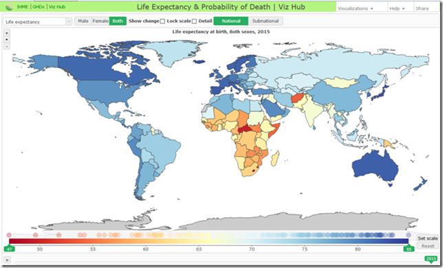
The Institute for Health Metrics and Evaluation (IHME) has some fascinating interactive data visualizations on its website.
You can select a chart type (such as USA health map, tobacco visualization, Life Expectancy & Probability of Death) and adjust a wide range of parameters -- such as country, age or gender – and see a visualization for that group of selection criteria.
For example, below is a life expectancy chart for both sexes combined, where those countries shown in lighter colors (red, orange, yellow) have the lowest life expectancies:
Here’s another one, showing life expectancies in the USA since 1981:

I commend that you check out the visualizations.

No comments:
Post a Comment
Note: Only a member of this blog may post a comment.