I’ve just been was using the Windows 8 registry editor (regedit.exe) in an attempt to remove the remnants of an application that wouldn’t uninstall cleanly.
Even with my shiny new 8-core processor, twin fast Intel SSDs in RAID configuration plus 32 GB of RAM (rarely is even a quarter of this RAM used), there were periods of up to a minute when the registry editor was scanning for a search string.
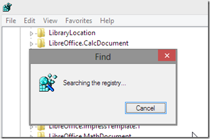
During this boring period it simply displayed the following bland, deadly boring [Windows 8 flat, colorless, unappealing] dialog box:
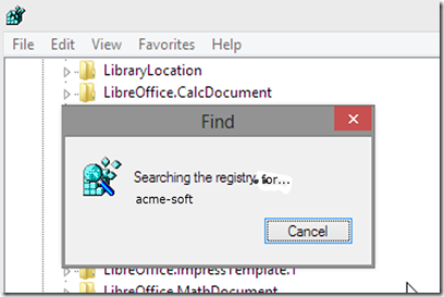
I wonder why on earth some of Microsoft’s developers seem so short-sighted and not to think about the user’s experience. . . . Searching the registry for what, fellas?
In this case, if it was me writing the registry editor then the above dialog would for sure have looked something like this quick mock-up:
It ain’t rocket science!


And why don't they index the registry so searches don't take so long? 1990s mind set.
ReplyDelete