The first of an occasional series of opinion pieces about poorly executed software design and development, missed opportunities to do a lot better.
Since I’m still coming to terms with Windows 8 after upgrading from Windows 7 a month ago, why not start here?
Microsoft reworked the Windows Task Manager, which had remained largely the same from Windows 95 onwards, as described by the now ex-Microsoft Steven Sinofsky at The Windows Task Manager in the Building Windows 8 blog.
Their reasons for change all make sense, lots of telemetry and so on. Except in typical Microsoft fashion they weren’t thorough enough in their implementation and stopped short in some important aspects.
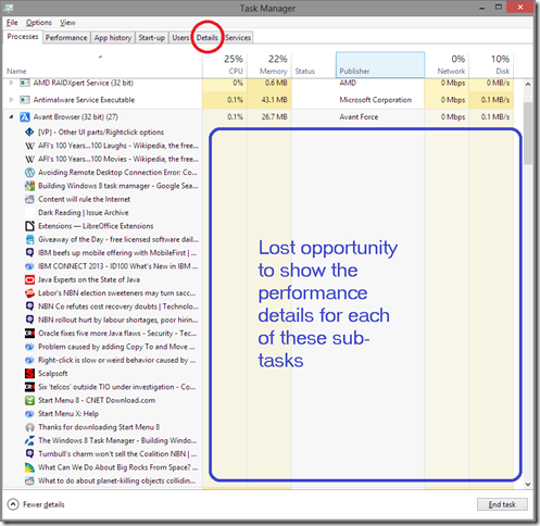
One of these is shown in the following screenshot of the “Processes” view:
It focuses on Avant Browser (in many ways superior to Internet Explorer) with multiple tabs open. Notice the large blank area (blue rectangle)? In this area they really should have taken the opportunity to list the detailed usage of CPU, Memory, Network and Disk for each of the browser tabs (sub-tasks) open in the browser.
This would be extremely valuable information to present, such as the fairly common situation where one of the tabs is chewing up a lot more resources than the others and you’re struggling to understand which of the tabs is the one causing the browser to run slowly or erratically.
Another lost opportunity is that the tabs across the top of the Task Manager window are fixed in position. They really should have made the tabs draggable so that you can rearrange them to suit your needs, and the last-used arrangement remembered when Task Manager is next opened.
In a month or so of intense Windows 8 usage I find myself still using the good old Details tab a lot because it shows tasks that don’t appear in the Processes view, and I want it on the left.. I Want it to be the default whenever Task Manager is opened, but alas the Processes tab always opens on the left and the last-used view of Task Manager if not remembered.
Curse them! There are some really smart people at Microsoft. Why do they come out with such stupid implementations? A big FAIL for their design-by-committee approach, I ‘d say.

No comments:
Post a Comment
Note: Only a member of this blog may post a comment.